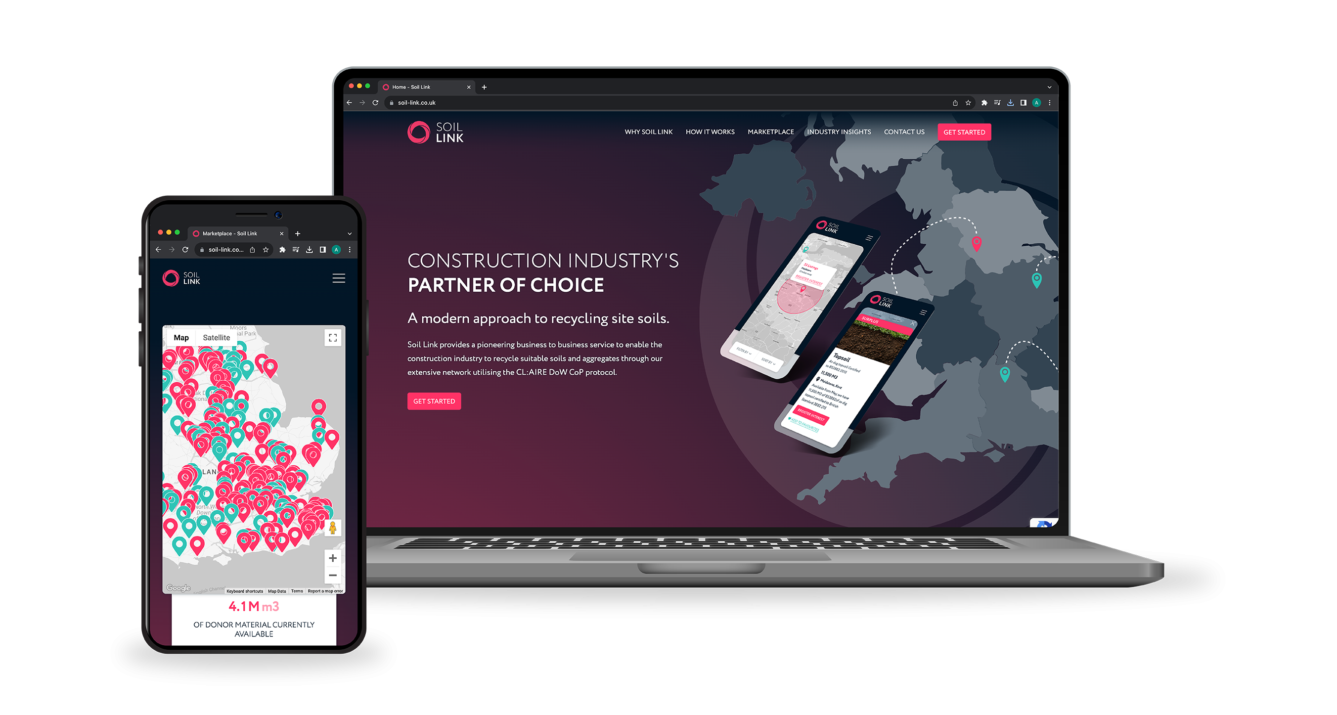
Paving the way for a new approach to aggregate procurement
Having previously collaborated with Amet Contracting Group to improve their website, we were delighted to be approached us to support their new start-up, Soil Link. Their mission: to simplify the construction industry’s aggregate and soil procurement process with a modern, sustainable approach to recycling site soils.
Their pioneering idea was to launch a B2B service to connect those with a need for aggregates, top soil, subsoil and gravel with those landowners with soil to spare – helping to facilitate a more cost-effective, sustainable and simplified transaction.
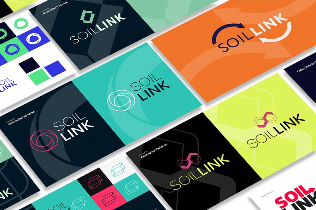
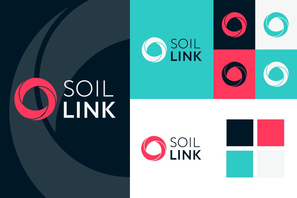
Brand venturing beyond tradition
To kick things off, we started with a conversation to establish their vision and create a visual strategy for their brand. The Soil Link team wanted something new and exciting that would venture beyond the traditional industry standards with a data-led feel that would evoke a sense of advancement that matched their innovative approach to the sector.
We took them through our established creative process from research and ideation through to development and brand creation. Through a series of collaborative sessions we presented early creative concepts to determine how their new identity would all fit together.
The end result was a ‘never-ending loop’ symbol that conjured up the idea of linking and connecting, and ease of process. Balancing this traditional symbol with a sans serif typeface and maintaining a level of simplicity ensured it felt fresh and contemporary. We debated a whole variety of colour palettes from bold and fresh, to calm and professional with each palette bringing different tones to the new brand. The chosen colours were carefully selected to instill sentiments of the future, innovation and progression by contrasting bright blue and pink with a deep and rich midnight blue.
Seamless, simple and strategic
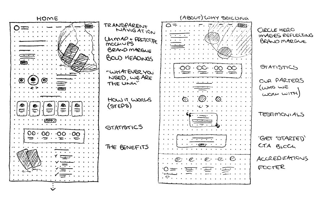
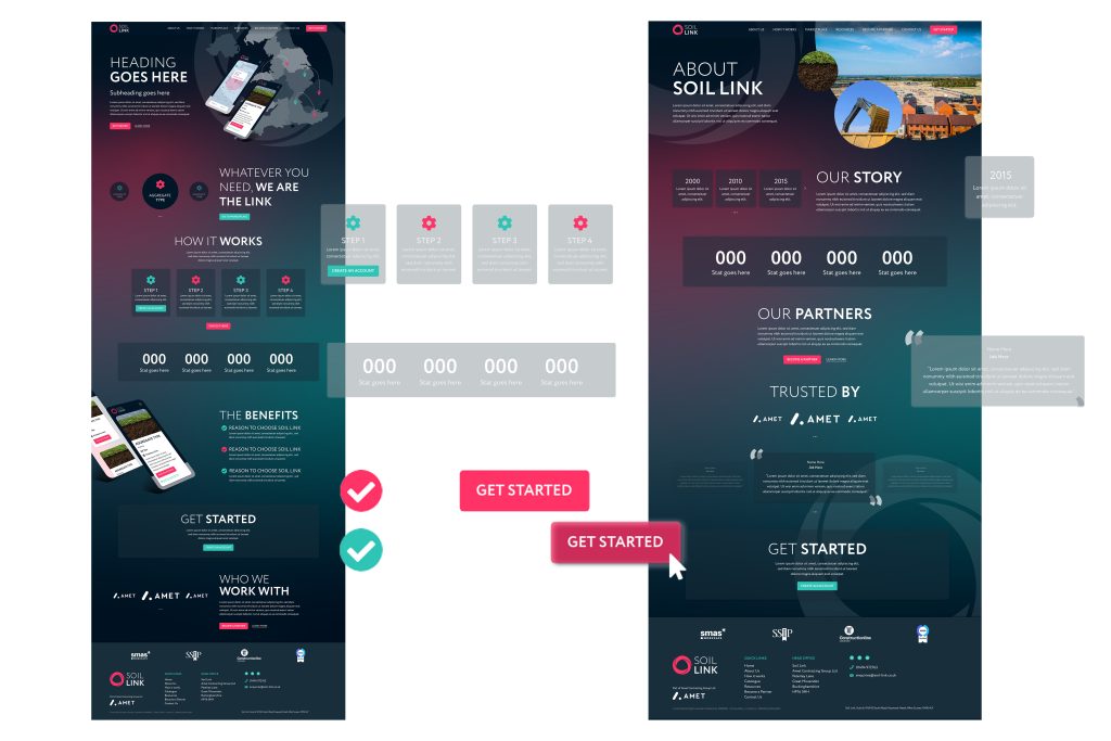
The brand’s presence is predominantly digital so it was vital that their new website was fit for purpose including being simple to navigate, user-friendly and interactive. Our UX session highlighted the importance of a strong brand presence, short snappy content and obvious user routes, achieved through clear headings and clear calls to action.
User personas all had one thing in common – these are busy people who want to get a quick and straightforward process that feels seamless. The proposed navigation reflected this with minimal pages to navigate and headings written with their challenges in mind. The end result : an effective user journey that proposes questions a user might have allowing them to easily navigate to the answer.
An innovative solution to marketplace challenges
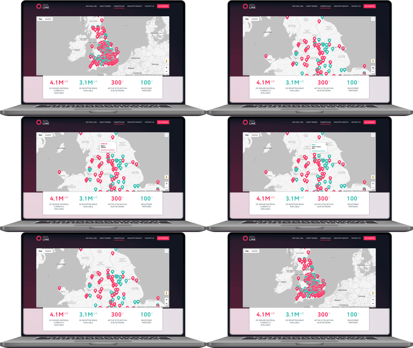
The biggest challenge, and one we enjoyed solving, was marketplace functionality. Through a carefully planned phased approach and soft launch, our build was based on real feedback and data. The system allows for two types of listing – surplus and requirement. It was vital the site seamlessly communicated with the data source to allow for a semi-automated set-up, making things simple both in terms of content management and user experience. A step-by-step form with a simple visual progress bar assists the process of registering interest.
Poised to revolutionise the industry
Pillory Barn worked closely with the Soil Link team to ensure the brand and website matched their ambitions as an exciting new start up business.
